Tuesday, May 4, 2010

Final Portfolio

Here is my final portfolio. The process of picking pieces was difficult but I am confident with the choices I have made. I definitely think this is some quality work. I am proud of each illustration.

Piece #1 - Life and Death

For the life and death assignment I wanted to do something different, something unique. I wanted an interesting concept that would get attention. I thought of Michael Jackson and the stages of his life. I pictured the young Michael Jackson and then the older, creepy alien-like Michael Jackson and how he was so much different that in his youth he was "dead." I thought a airbrush stencil look would fit and I really like how it turned out. It is also the only piece in my portfolio that is not watercolor. It shows I can work in other areas.


Piece #2 - Extra Illustration/Bruce Springsteen Rolling Stone Article

I chose to do an extra piece for my portfolio and I am really happy with the outcome. I feel like this is my best piece. It is a culmination of all the work I have done finding and honing my technique. It is deliberate with an unintentional feel. I really like the colors used too.


Piece #3 - State Postcard Illustration

Here is another piece where I wanted a "deliberately un-deliberate" watercolor portrait. This is the home state postcard assignment and its also my most recent. I am really happy with how it turned out. It has a nice quality to it where it doesn't look overworked. I was confident throughout the whole process as well and I think it shows my confidence in my own style.


Piece #4 - Memory Portrait

The fourth piece is a memory portrait of my dad. think the simplicity of his face and skin is effective and the contrast between the bright color in the background is my favorite part.


Piece #5 - Self Portrait

This is my second favorite piece and I feel like it was the first piece where I cam comfortable with a style all my own. I like the color and I think the background is interesting. I enjoy using color shapes as value. I have learned from this piece to not overwork anything. I also think this style is deliberately quick and representational. I am not interested in making it 100% photo realistic but creating a style where you can balance realism with representation is what make s a successful illustration, especially in watercolor.


Piece #6 - Osama Bin Laden Portrait Excerise

The Osama was from the multiple watercolor illustration. I did 10 of them and the quantity created this cool illustration. It has a nice quality to it and looks quick but realistic/tight. I also went all out on color and chose ones you would not see in a realistic Osama. This was my highest rated piece on my midterm portfolio and I can see why. It is visual appealing and shows how the spontaneity of watercolor can be really effective and cool.

Piece #7 - Article Illustration

This piece was one of the last pieces I did and it shows my growth in style. It is confident and deliberate without the intentional aspect showing through. I really liked the tractor in the back, the simplicity of it and how it is suggestive.


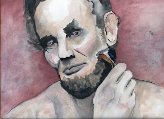
Piece #8 - Reflections on Lincoln Illustration

I think this is one of my strongest pieces. I wasn't afraid to let the color as as shape do the work like most of the others. Besides the color and form I feel my concept was the strongest. I wanted something modern, unique and interesting and not just a portrait. I wanted to grab peoples attention and I think I succeeded. I am very happy with this piece.


There is my final portfolio! It has been a great semester of Illustration. I have learned so much and have enjoyed every second of it. It has been my favorite class by far. I really hope my skills continue to grow so I can make illustrating a part of my career. I I feel like I have come a long way since the first wash and line assignment we did. I developed a style and have gotten comfortable with a media. I think my work is very high quality, and I am confident in every piece. Thanks to Rusty for the help with technique, style, and everything else.


Article Illus.


Here is the illustration for the article, "Farmers survive Harsh Winter."


Extra Illustration


This is my extra illustration. Long live The Boss.

Monday, April 19, 2010

Final Life and Death


Here is the final life and death illustration. I like these alot. Adding color was a good choice on both.

Friday, April 16, 2010

Life and Death Illustration


Here is my initial comp for the life/death assignment. I like this idea alot. I am thinking airbrush stencils.

The life is young Michael Jackson, (circa /jackson 5 days)

The death is the white woman he turned into. Why Mike?

Comp for Editorial


Here is my initial comp for the editorial assignment. I chose the farmers article.

Final Abe Lincoln


Here is the final Abe illustration. It is Abe touching up the beard with Gillette Fusion razor (rights reserved to Gillette) . I like how this turned out. Lookin' good Abe

Final Cheesy


Here is my final cheesy used car salesman. I actually am happy with it. But please...no more airbrush

Friday, April 2, 2010

Final memory Portrait


Here is my memory portrait. Not using a picture is harder, I had a tough time getting that detail that really makes the picture. I am still happy with the end result though.

Color Comp for cheesy airbrush


Here is my comp of the used car salesman. This screams cheesy.


Final 11


Here is the final pool ball. Not a huge fan.


Monday, March 22, 2010

Number 11

My number 11 illustration will be a pool ball. Boring.

Here is the color comp...

Memory Portrait

Here is the initial comp for my memory portrait. Im thinking watercolor....

(portrait is of my dad)


Airbrush

We have started airbrush but none of my practice runs are blog worthy...more to come.

Friday, March 5, 2010

Midterm Portfolio


Here are the five pieces for my midterm portfolio. A majority of my pickings are watercolor assignments, with one line art illustration.


This is the home state postcard assignment and its also my most recent. I am really happy with how it turned out. I spent the most time of this watercolor then any other that I have done. I still think it has a nice quality to it where it doesn't look overworked. I was confident throughout the whole process as well and I think I am starting to show my confidence in a style.
This illustration is the only one in my portfolio that is not watercolor. I like this piece and chose it because it shows my skill in line work and in black and white also.

The Osama was from the multiple watercolor illustration. I did 10 of them and the quantity created this cool illustration. It has a nice quality to it and looks quick but fairly realistic/tight. I also went all out on color and chose ones you would not see in a realistic Osama.


This is my favorite piece and I feel like it was the first piece where I cam comfortable with a style all my own. I like the color and I think the background is interesting. I enjoy using color shapes as value. I have learned from this piece to not overwork anything. I also think this style is deliberately quick and representational. I am not interested in making it 100% photo realistic but creating a style where you can balance realism with representation is what make s a successful illustration, especially in watercolor.

The last piece is my product illustration for red stripe beer. I like how it turned out and keeps my style without getting too quick. It was more deliberate than most of my watercolors (Osama, self portrait) and it is fairly tight.


Final Postcard

Here is the final postcard of John Wayne. Im happy with how it turned out.

Monday, March 1, 2010

Postcard Comp


Here is the Color comp. for the state postcard. John Wayne with the state flag in the background. "Wa-ha."

Like the look so far, in marker. Hopefully it translates to watercolor.


Monday, February 22, 2010

20" x 30" Watercolor

For the big watercolor I chose to do a picture of blues guitarist Muddy Waters. I found it very hard to get the effects, drips, etc I wanted in a larger scale. It is definitely not my best one but I learned from it. Lets keep it small scale from now on Rusty....

Monday, February 15, 2010

Final Line Art

Final line art illustration for a news article. Bonaroo music festival 2010 with headliners Stevie Wonder, Jay-Z, and Kings of Leon. High contrast collage with marker, not bad..

I have included the color scan of the drawing and then a black and white scan.

Product Illustration Final

Here is the final product watercolor for Red Stripe Beer. I really like how this turned out. It has some interesting qualities. Rather then have a background, I chose to leave the space around the object blank and kept my grounding shadow minimal. Overall, I think it turned out pretty good. I messed up and accidently got splatter on it so I have added a photoshop version without the splatter.

Wednesday, February 10, 2010

Article Illustration

Here is the initial sketch for my news article. It is announcing the headliner acts for Bonaroo 2010. The illustration will be a high contrast collage of Stevie Wonder, Jay-Z, and Caleb Followill from Kings of Leon.

Product Illustration

Here is the initial sketch for my product illustration for Red Stripe beer. Hooray for beer.


Monday, February 8, 2010

Antique Photo

This is the in class watercolor of the antique photo we found. I like how the guy turned out but I hate the background, it needs a more washed out look.

Osama

Bin Laden watercolor. I really like how this one turned out. I still could add some more detail but I would end up overworking it. At least it's unique..

Wednesday, February 3, 2010

More objects

Ten more objects were due for Wednesday. I really like two of them and think they are effective. I am still going too dark too early and will have to work on that.

Monday, February 1, 2010

Wildlife

I chose to do a grizzly bear for my wildlife watercolor. I tried to concentrate on the background first only using blocks of color and not a wash. I wanted to get the effects Rusty gets in class but I think I overworked it, big surprise. The bear itself was a challenge. I again wanted to break in into a value range and keep it between four to five blocks of color and not a wash. I ended up blending the colors though trying to create the hair. I think the best technique is to let it dry and then go back with line art, whether markers or watercolor pigment, for the details like hair.

Objects

Here are the objects we did for class on Monday. I think two of them are effective while the others are not as good. The chair and the building have a nice quality to them. Some get to muddy and lose any realism. I am putting pictures of the best ones and not all of them.

Friday, January 29, 2010

In-class self portrait

For class today we did a self portrait with detail added at the end. I tried to not overwork the background and keep the wash simple. I think I am somewhat developing a style with more messy planes of color. I am just trying to improve and I think Im getting there. It's not great but you have to start somewhere. Below is the picture of me and then the watercolor.


Watercolor with line art

Here are my three watercolor drawings with line detail added. I chose to do two landscapes and and a interesting looking chicken. It is hard trying to not over add detail with these. I think the chicken is somewhat successful but the landscapes are not that good. Hopefully I improve?

Monday, January 25, 2010

Final Line Art Drawings

Here are the two line art drawings that Rusty chose from Wednesday. My drawings consist of a contact case and a pair of glasses. The case was more of a messy/loose style with more etching and scribbles to create value whereas the glasses were using directional line. I tried to maintain a sharper more precise style with the glasses also.